Cafeのウェブサイトを作る②【CSS】
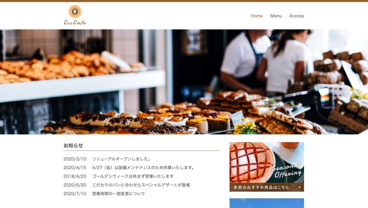
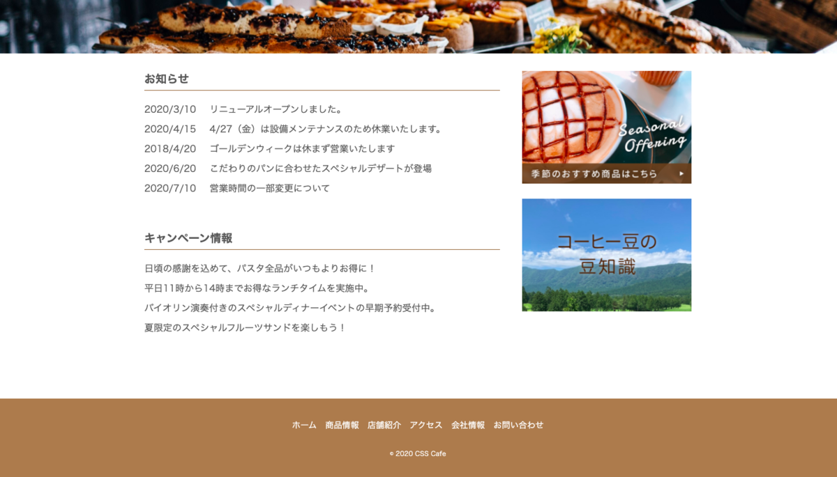
完成図は以下の通り。
こちらのcssは以下の通り。
@charset "utf-8";

/* common */
html {
  font-size: 100%;
}

body {
  /* font-familyは左からmac, windows, その他 */
  font-family: "Hiragino Kaku Gothic proN", "メイリオ", sans-serif;
  color: #555;
  /* 行間を空ける */
  line-height: 1.5;
}

img {
  width: 100%;
}

.wrapper {
  max-width: 940px;
  /* 0は上下の指定、autoは左右の指定(コンテンツが中央に来るように設定) */
  margin: 0 auto;
  /* スマホの画面設定(左右に余白がつく) */
  padding: 0 10px;
}
/* ここまでが共通部分 */

/* header */
header {
  border-top: 8px solid #8c6239;
}

.header_logo {
  width: 90px;
}

.header_content {
  /* 子要素を横並びにする */
  display: flex;
  align-items: center;
  /* 子要素を両端に離す */
  justify-content: space-between;
  margin: 10px auto;
}

header nav ul {
  display: flex;
}

header nav ul li {
  margin-left: 30px;
}

header nav ul li a {
  /* アンダーライン消す */
  text-decoration: none;
  color: #555;
}

header nav ul li a:hover,
header nav ul li a:active,
header nav ul li.current a {
  color: #8c6239;
}

#main_image {
  width: 100%;
  height: 50vh;
  background-image: url(../images/cafe.jpg);
  background-repeat: no-repeat;
  background-position: center;
  /* 画像をできるだけ拡大 */
  background-size: cover;
}
/* ここまでがheader */

/* contents */
.contents {
  display: flex;
  justify-content: space-between;
  margin-top: 30px;
}

#main_content {
  width: 65%;
}

#sidebar {
  width: 31%;
}

#home h2 {
  margin-bottom: 20px;
  padding-bottom: 5px;
  border-bottom: 1px solid #8c6239;
  /* 親要素のサイズを基準の1として1.2倍 */
  font-size: 1.2rem;
}

#info dl {
  display: flex;
  /* itemを改行 */
  flex-wrap: wrap;
  margin-bottom: 50px;
}

#info dt {
  width: 7em;
}

#info dd {
  /* 横幅を計算 */
  width: calc(100% - 7em);
}

#info dt,
#info dd {
  margin-bottom: 10px;
}

#campain ul li {
  margin-bottom: 10px;
  /* 丸ブロを消す */
  list-style-type: none;
}

#sidebar ul li {
  margin-bottom: 20px;
  list-style-type: none;
}

/* footer */
footer {
  margin-top: 100px;
  padding: 30px;
  text-align: center;
  color: #fff;
  background-color: #a67c52;
}

footer ul {
  margin-bottom: 20px;
  font-size: 0.9rem;
}

footer ul li {
  /* 子要素を横並びにし、幅を臨機応変に変える */
  display: inline-block;
  margin: 5px;
}

footer ul li a {
  color: #fff;
}

footer ul li a:link {
  text-decoration: none;
}

footer ul li a:hover,
footer ul li a:active {
  /* 不透明度 */
  opacity: .7;
}

small {
  font-size: 0.7rem;
}

/* responsive(スマホ対応) */
@media(max-width: 600px) {
  html {
    font-size: 87.5%;
  }

  .header_logo {
    width: 60px;
  }

  .contents {
    /* 子要素を縦に並ぶようにする */
    flex-direction: column;
    margin-top: 10px;
  }

  #main_content,
  #sidebar {
    width: 100%;
  }
}
CSS部分は一つ一つ理解していくことが重要だなと感じました。今自分が書いているコードを実際に実行させてみて、どういうデザインになるのか一つ一つ確かめながら勉強していくことで上記のコードを理解することができました。このブログは備忘録としても活用し、常日頃見返していこうと思います。
参考文献 : 中村祐太. ウェブ開発入門完全攻略コース - HTML/CSS/JavaScript. プログラミングをはじめて学び創れる人へ!
ウェブ開発入門完全攻略コース - HTML/CSS/JavaScript. プログラミングをはじめて学び創れる人へ! | Udemy